Tuesday, 26 December 2017

Left Behind Film Poster

Original image.


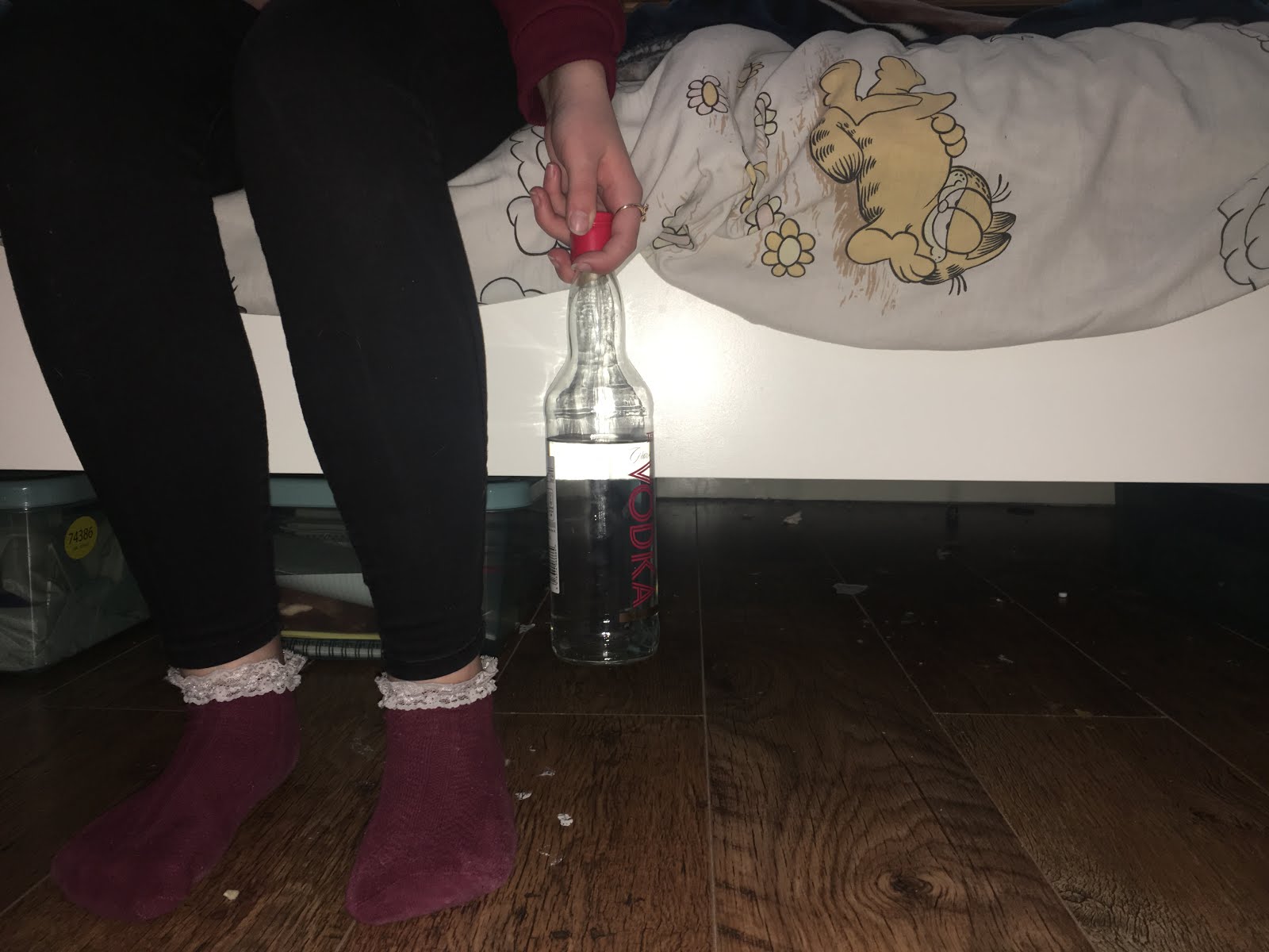
I have tried to make it look like there is a hand coming out from under the bed, about to grab someone's legs. This is because it links to our trailer directly. I did this by taking a photo of the bed and then a photo of someone's hand reaching out, I then photoshopped the two together.


For the text, we used the same font as the title for the release date to keep synergy throughout the poster. I have included the actor's names as this is a feature used a lot on posters as the actors would normally be well known and create star power. 
The only red elements on the poster are the socks of the character and the red cap on the vodka bottle. I have avoided using lots of red as that is more of a horror genre convention. I have used white text and dark colours which links back to the research we did on psychological thriller posters.


I have added a tagline and some red text to connote fear as well as draw the views eyes around the poster. 

Monday, 25 December 2017

Feedback for Draft 2

When reviewing our trailer we noticed that there is an error in one of the shots. Rachael can be seen in the reflection of one of the windows. In our next draft, we will make sure there are no more errors like this. I fixed the shot by cropping the image, removing Rachael's reflection from the frame.

This draft was to focus on the visuals, the next draft we make will include a main track and more sound effects.

Some other feedback we received was that we should include variation in our clip length. We should also try and zoom in
on some areas of the clip so the audience know what to focus on as it isn't very obvious.

For our third draft we will take onboard the feedback we recived.

Feedback:

  • Intersperse the shorter clips inbetween slightly longer ones 
  • Include visual effects 
  • Ensure the focal points are clear


One comment we recieved was that our trailer felt very clostrophobic due to all the close ups. For this project we think that is positive as we want the viewers to feel uncomfortable. In the trailers we researched, this is a common convention as it conveys the genre succesfuly. 

Sunday, 24 December 2017

Music and sound effects


This is the main soundtrack we will use for our psychological thriller trailer. We think this clip is good as it creates tension and fits the genre. We plan to edit the clip, separate the sounds and disperse them throughout to gradually build drama.

Finding royalty free music for our trailer was really hard. We found all of these clips on YouTube as they were free to download and use. Other sound effects we found are ambulance sirens, dramatic piano pieces and static.

All of the other noises in the film are natural and diegetic apart from a few that we re-recorded and dubbed over. For example, when Jenny is knocking at the door, the sound was added in afterwards but when Sophie blew out the candle the sound was from the original recording.

https://www.youtube.com/watch?v=337A0Alo8UQ


https://www.youtube.com/watch?v=b_96Okd3FTI

https://youtu.be/Y62EgHvwa8k

We think our main track links back to our research of The Girl on the Train's trailer as in that trailer the tension builds really quickly and suddenly stops for a chilling atmosphere.

We want to achieve rhythmic editing throughout our trailer by syncing the editing pace with the beats of the soundtrack. This is a common convention and is successful in building tension.


This is a screenshot of the sound bites in the editing stages. 

Poster initial ideas


These are the main ideas we had for what we could include for our poster and magazine cover. As our trailer doesn't create an attachment to a particular character and we never see one character extremely close up, we don't think that having a conventional close up of a character would be fitting for our film poster. All the images we have taken relates to a different scene within our trailer.

Friday, 22 December 2017

Psychological magazine cover ideas and examples.


These magazine covers promoting psychological thrillers both include simmilar colours. Both posters use red and blue to convery the genre.  The magazine covers both have a intriquing tag line above the title to make an audience want to find out whats in the magazine. The main image is made up of the main character from the feature film, stood in the centre, looking directly into the camera. For our magazine covers we will use a creative alternative to a centered main charcater because we dont believe this will fit our trailer as we no attachment is created to any one role.
When creating our own magazine covers we will link back to the reseach we did at the begining of our blogs.

Tuesday, 19 December 2017

Titles and Intertitles

We have not included intertext in our trailer because we thought it was unnecessary as the majority of the narrative is easy to follow without explanation. We also agreed that having intertext would ruin the immersion for the audience and erase all the suspense that we had built.

We reseached already existing billing blocks and used these to create a structure for our own. We included the names of our actors and our production company logos as well as a age rating and the title.


We used the closest font to the common font used in professional billing blocks to make our trailer look as offical as possible. 


We didn't include any reviews of the film in our trailer as the tailers we looked at (The Snowman and The Girl On The Trian) for research only included the title, billing block and release date. 
We used a similar font for the realse date as the title to create a synergetic link throughout the
trailer.