Sunday 31 December 2017

Evaluation 1: Media Conventions


In What Ways Do Yours Media Products Use, Develop or Challenge Conventions From Real Media Products?

Titles

Throughout creating our psychological thriller, we have tried to keep the classic conventions which we have found from researching already existing films and trailers.


For our title, we have used a handwriting font called 'Brio' which is similar to other fonts that can be commonly found in the thriller genre as it can have a chilling impact. We agreed on the title 'Left Behind' and we think this sounds more intriguing and thought-provoking than scary. We decided on a vague title name to get the audience asking questions like who’s left behind and why. This will get an audience interested and want to watch the film. We knew that our title and font would be used across multiple platforms like magazines and poster, so we chose to use a recognisable font.

Image result for the sixth sense title

We have kept our title short as titles usually only consist of one or two words like The Purge or Se7en. This is important as it makes the title rememberable for an audience as well as being vague enough that they will want to watch the film to find out what it means. Psychological thrillers commonly use white titles on black backgrounds so we kept to this convention to successfully convey the psychological genre.

‘Left Behind’ is a suited title to our film because the trailer we see that the main character’s best friend goes missing, leaving her behind. The title is said in the trailer, although it isn’t obvious if this is misleading to the audience as we have used non-continuity editing. Therefore, audiences will want to see the film and find out the true story.

Handwriting in thrillers is often used to be suggestive of communication from children, the terrified or the dead. Children are often used in psychological thrillers such as 'The Hand That Rocks the Cradle' because they are stereotypically very vulnerable.

The word ‘left’ suggest that this is a choice-less decision, the character has no choice but to be left behind. This word choice will leave audiences with a desire to know the situation in which they’ve had to be left behind. This adds another element of interest for an audience, enticing them to see the full film.  I think this title will appeal more to active audiences who will analyse and be interested in the details of our trailer.

Settings

The settings we have used at the beginning of the trailer are all homely and comforting like the kitchens and the bedrooms. We actively decided to use a house that we knew would create a sense of safety and establish equilibrium in the beginning. These settings are also very familiar to middle-class citizens and normal people, these people are also most likely to be regular cinema-goers which will create more of an impact on them as they may believe that the situations could happen to them in their own homes or to their families.

The settings change to more unfamiliar and harsh settings as the trailer moves on. For example outdoor locations, hostile and unwelcoming rooms. This has been done to make the audience feel uneasy and unsafe. E.g. Jenny's bed is not made in the last few scenes of our trailer which coveys an uncomforting and hostile environment. This element is also telling of how 'messed up' Jenny has gotten by this point of the film.

We avoided using country or rural settings as this is more representative of the horror genre.


Storyline

Rachael and I have tried to create a trailer that resembles a psychological thriller rather than a horror. As these two genres are very similar this was quite difficult. We tried to steer away from horror by not including jump scares in our trailer or lots of screaming. We left our trailer with on a cliff-hanger to entice the audience to watch the film in the cinema to find out what happens. We have created an ambiguous ending by showing a hand coming out from under the bed and then a voice-over of the main character saying ‘Sophie?’ This leaves the audience asking more questions than being scared or traumatised. Throughout the trailer, there is no obvious antagonist which leads the audience to imagine the worst thing they can. This can bring more fear and suspense to an audience than actually showing the face of the antagonist like they do in quite a few horror trailers.


Characters

Psychological thrillers often have many characters as some may go missing or there may be multiple storylines happening at once. We have only introduced four characters in our trailer. We think this makes the trailer and storyline easier to follow and understand. The antagonist is never fully revealed to the audience which keeps the audience in suspense and will mean they need to watch the film to see the reveal. This is conventional as antagonists are really identified in psychological thriller trailer and in the films they are either revealed at the end or not at all to increase the distress. For example, in ‘The Snowman’ we never see the killer. The outfits we chose for the characters to wear all came from our research into already existing psychological thrillers. It could be said that it isn’t obvious from our trailer which is the main character as they all have important roles in the synopsis. However, Jenny has the most screen time and helps the narrative develop the most, suggesting that she will be the main focus of the film.

We have portrayed Jenny and Sophie’s characters as best friends but as Sophie’s character goes missing in the first 10 seconds of the trailer, we never see them being best friends. There is evidence in the trailer that suggests we will be shown some of their friendship in the full film for example: when Jenny meets Sophie at her house before school and when they have been taking pictures together. This will be relatable to our target audience as most female teenagers have best friends who they do everything with. This will create sympathy from the audience as they will understand. We also have cast a mother character in our trailer. We think that this will provoke emotion in any older women who watch the film as they may have children of a similar age.

We have used teenagers as this is the demographic of people who are most likely to go to the cinema meaning they will be able to relate the most to the content. Teenagers are often seen as children by adults as they can be vulnerable and irresponsible. This could bring more fear to the adults watching as they are worried about the youths.


Props

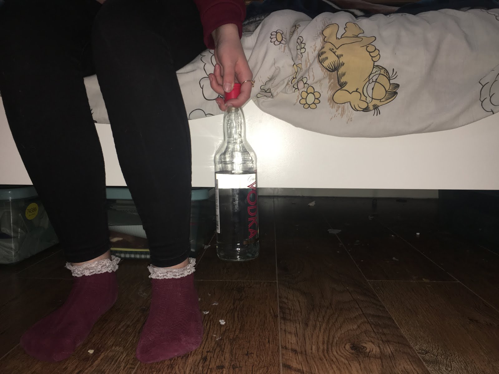
The props we have used within our trailer are commonly used within the psychological thriller genre. For example the alcohol and the pills. This is because they have a psychological effect on your mental stability. The main character is seen drinking outside in the rain to create a pathetic fallacy and she is seen with pill packets in the kitchen. These props connote the desperation and despair of the character once her friend goes missing.  However, these props are more commonly linked to the antagonist as they are usually represented as unstable. This means that our representation of the protagonist in our trailer could be counter-typical. Additionally, the representation could be misleading; audiences would need to watch the full film to know if Jenny's character is really the protagonist.

We have used mobile phones in some of the scenes of the trailer as iconography. The use of phones shows the age of Jenny's character as it is stereotypical for teens to use their phones a lot. The phones also create verisimilitude within the trailer and make the situation feel more real to audiences.


Camera and Editing

For the shots that we wanted to be really steady like the bed shots and establishing shots of settings, we used a camera stabiliser, Dji OSMO. We kept some shaky hand help shots in the trailer to create an uneasy atmosphere and make the footage feel more real and gritty. Unlike successful production companies who have budgets for technical hardware, we have had to use our phones to film our trailer. We felt that the unsteady shots represented Jenny’s character and her journey from being normal and happy through to in despair.

We tried to show a variety of different shots as this is very important at keeping an audience interested and actively watching the material. We have used a variety of short and long clips throughout, gradually building to all short clips, creating a climax. We have used rhythmic editing in our trailer where the cuts are in sync with the music. The music we have used, we edited so that it gradually built up to a climax to match the visuals. This is very conventional in the majority of trailers throughout most genres. This technique can be found in ‘The Snowman’ which shows that we have linked to our research and have used technical conventions found in real media products.

We have used non-continuity editing which is heavily used in trailers. We have created non-chronological editing by including lots of clips that would make sense once you’ve seen the film in between key narrative points of the trailer. This is a stereotypical convention of the structure of trailers in general.
Image result for dji osmo mobile

Special Effects

For special effects, we used filters over some of the shots to make them appear more visually grungy and dark as when we filmed it was full daylight and we thought this would ruin emersion of the trailer. To create the news report I used lots of effects when editing. I used a static overlay and cut to black transitions to make the footage appear corrupted. We avoided distorting the footage too far that it became unrecognisable because we didn’t want to disorientate the viewers or ruin the verisimilitude, decreasing the suspense and anxiety. When doing research into existing trailers, we did not find many special effects such as colour overlays or distortion. For the flashback moments of the two girls being best friends, I used the romance overlay filter on iMovie that blurred the edges of the footage, suggesting Jenny is drunk and this is that her vision looks like. This element also exaggerates that these images are from the past as they are fading memories.

Magazine Cover

I have created an unconventional magazine cover. Film magazine covers typically have a main image of the character from the feature film they are promoting. As we don't believe that our film would be recognisable from a face we have chosen to use a scene from the trailer that could be identifiable as Left Behind. I have created synergetic links between the trailer and the magazine by using the same font that we used for the title and release date at end of our trailer. I have tried to create a magazine cover that conveys the psychological thriller genre by using dark colours, white and some elements of red. I tried to avoid using too much red as it would become a horror magazine. I have used classic conventions of real film magazines such as; cover lines, pugs and gratifications.

Film Poster

From researching already existing film poster or psychological films we found that the posters commonly feature an image of the main characters face. I chose to focus on the key part of our trailer as I felt this was more significant and recognisable. I used the main image of some feet hanging off the edge of a bad with the person holding a bottle of vodka. I have edited a hand coming out from under the bed to create a direct link to our trailer. I started with the main image in Photoshop and blocked out under the bed with a black gradient. I selected the vodka bottle and copied it onto the layer above so it was unaffected by this. To make the hand come out from under the bed, I took close-ups of someone’s hand and cut it out. I pasted it onto a layer behind the girl's legs as if they’re about to be grabbed.

Thursday 28 December 2017

Draft Three


Feedback:

Make the shots even faster
Mix up the beginning, even more,
include a written note that relates to the title 'Left Behind'


Tuesday 26 December 2017

Left Behind Magazine Cover


I have tried to link back to my research within my magazine cover as I have used red for the cover line titles and white text to help convey the psychological thriller genre.

 To create this magazine I used an image that relates to the trailer as the main image. I have used a filter over the image to create a dark and ominous atmosphere. I have used the font Impact for the cover lines, title and tagline. This is a typical convention found in already existing magazines as it is a strong, bold font.

I have used pugs and gratifications where the audience have been promised that they'll see certain things inside the magazine. I have included an issue number, prince, website, barcode and publication logo as these are found in all existing magazines.

The composition of this magazine is not entirely traditional as the image is off centre. Main images on front covers tend to be in the centre and are the first thing you see. As a close up of a characters face would not be the strongest synergetic link between the magazine and the trailer, we have used an image of a female looking out the window. The picture is off centre meaning that in the centre of the piece there is nothing interesting to look at.


After some feedback I received about my magazine cover, I have made some changes to the main image. I have changed the main image to be conventional and suitable for the genre. I have included the face of the main character from our trailer as this is more true to the psychological thriller genre. 


I have added more pugs and gratifications to fill up the empty space on the cover. 
 
 
I have moved the magazine title behind the characters head to create more of a mainstream magazine cover. Popular and mainstream magazines can cover some of their title as fans and readers will recognise the format.
 

Left Behind Film Poster

Original image.


I have tried to make it look like there is a hand coming out from under the bed, about to grab someone's legs. This is because it links to our trailer directly. I did this by taking a photo of the bed and then a photo of someone's hand reaching out, I then photoshopped the two together.


For the text, we used the same font as the title for the release date to keep synergy throughout the poster. I have included the actor's names as this is a feature used a lot on posters as the actors would normally be well known and create star power. 
The only red elements on the poster are the socks of the character and the red cap on the vodka bottle. I have avoided using lots of red as that is more of a horror genre convention. I have used white text and dark colours which links back to the research we did on psychological thriller posters.


I have added a tagline and some red text to connote fear as well as draw the views eyes around the poster. 

Monday 25 December 2017

Feedback for Draft 2

When reviewing our trailer we noticed that there is an error in one of the shots. Rachael can be seen in the reflection of one of the windows. In our next draft, we will make sure there are no more errors like this. I fixed the shot by cropping the image, removing Rachael's reflection from the frame.

This draft was to focus on the visuals, the next draft we make will include a main track and more sound effects.

Some other feedback we received was that we should include variation in our clip length. We should also try and zoom in
on some areas of the clip so the audience know what to focus on as it isn't very obvious.

For our third draft we will take onboard the feedback we recived.

Feedback:

  • Intersperse the shorter clips inbetween slightly longer ones 
  • Include visual effects 
  • Ensure the focal points are clear


One comment we recieved was that our trailer felt very clostrophobic due to all the close ups. For this project we think that is positive as we want the viewers to feel uncomfortable. In the trailers we researched, this is a common convention as it conveys the genre succesfuly. 

Sunday 24 December 2017

Music and sound effects


This is the main soundtrack we will use for our psychological thriller trailer. We think this clip is good as it creates tension and fits the genre. We plan to edit the clip, separate the sounds and disperse them throughout to gradually build drama.

Finding royalty free music for our trailer was really hard. We found all of these clips on YouTube as they were free to download and use. Other sound effects we found are ambulance sirens, dramatic piano pieces and static.

All of the other noises in the film are natural and diegetic apart from a few that we re-recorded and dubbed over. For example, when Jenny is knocking at the door, the sound was added in afterwards but when Sophie blew out the candle the sound was from the original recording.

https://www.youtube.com/watch?v=337A0Alo8UQ


https://www.youtube.com/watch?v=b_96Okd3FTI

https://youtu.be/Y62EgHvwa8k

We think our main track links back to our research of The Girl on the Train's trailer as in that trailer the tension builds really quickly and suddenly stops for a chilling atmosphere.

We want to achieve rhythmic editing throughout our trailer by syncing the editing pace with the beats of the soundtrack. This is a common convention and is successful in building tension.


This is a screenshot of the sound bites in the editing stages. 

Poster initial ideas


These are the main ideas we had for what we could include for our poster and magazine cover. As our trailer doesn't create an attachment to a particular character and we never see one character extremely close up, we don't think that having a conventional close up of a character would be fitting for our film poster. All the images we have taken relates to a different scene within our trailer.

Friday 22 December 2017

Psychological magazine cover ideas and examples.


These magazine covers promoting psychological thrillers both include simmilar colours. Both posters use red and blue to convery the genre.  The magazine covers both have a intriquing tag line above the title to make an audience want to find out whats in the magazine. The main image is made up of the main character from the feature film, stood in the centre, looking directly into the camera. For our magazine covers we will use a creative alternative to a centered main charcater because we dont believe this will fit our trailer as we no attachment is created to any one role.
When creating our own magazine covers we will link back to the reseach we did at the begining of our blogs.

Tuesday 19 December 2017

Titles and Intertitles

We have not included intertext in our trailer because we thought it was unnecessary as the majority of the narrative is easy to follow without explanation. We also agreed that having intertext would ruin the immersion for the audience and erase all the suspense that we had built.

We reseached already existing billing blocks and used these to create a structure for our own. We included the names of our actors and our production company logos as well as a age rating and the title.


We used the closest font to the common font used in professional billing blocks to make our trailer look as offical as possible. 


We didn't include any reviews of the film in our trailer as the tailers we looked at (The Snowman and The Girl On The Trian) for research only included the title, billing block and release date. 
We used a similar font for the realse date as the title to create a synergetic link throughout the
trailer.

Sunday 17 December 2017

Psychological Thriller Posters

Image result for psychological thriller posters


I have researched some already existing psychological thriller film posters to get some ideas for when I make one for our Left Behind Trailer.


The common convention used within these posters is that they all include a close up of the main character's face. The text is very simplistic and the title is commonly found under the face. The colour schemes used in this genre are mainly dark colours like black and grey.


I like these posters because they are landscape and differnet to conventional psychological thriller posters. I prticually like The Snowman film poster as it is a still taken from the trailer and film isteslf. This helps viewers link the two together, creating a wider audience for the film. 


For my poster, I will link back to my research and include a dark colour scheme. We have discussed these conventions and we both think focusing on a character's face would be unsuitable for our posters and magazines as our trailer is mainly based on locations and events. We think that relating to an event in the trailer will be more impactful as audiences are more likey to remeber a scene than a face from our trailer. Therefore, using a photo of a recreated scene from our trailer will be more impactful as audience will recongnise the film/trailer from the image.

Friday 15 December 2017

Notes and Feedback 1

When our first draft was presented to the class we received feedback on how to improve
  • Finish adding sound effects
  • Find and include suspense building music that we can include from the beginning
  • Cut the shots down from 1.5 seconds to 1 second or less

They liked the varied interesting shots, the dialogue and the intense hand coming out of the bed at the end. They thought we had a good use of settings and non continuity.

For our second draft we will take the advice on board and make the trailer more impactful.

Wednesday 13 December 2017

Sophie and Jenny's Photos

To create stronger verisimilitude during Jenny's breakdown, we had her scroll through photos of her and Sophie. To make this scene more real we made Frankie and Millie take selfies together on Snapchat and we took photos of them being silly together. This Shows their friendship and them both being really happy together in the past. this adds to the trailer as it makes us feel sad for Jenny's character. Using this element can also have more impact on the audience as they will all have a best friend and they may apply these events to their own lives.  

Tuesday 12 December 2017

Filming Changes

Rachael and I originally cast Bryony Whittingham to play Jenny in our trailer. She has recently told us as she has no time and unfortunately she will be unable to help us with our work. Together, we discussed casting Rachael's sister, Frankie, to play the role of Jenny and we planned to film on Monday (11th). However Frankie said she wasn't able to film that day so we just filmed what we could will Estelle.

On Monday we were able to film lots of shot clips that once put together will help make the montage for our trailer. We now plan to film with Frankie on either the 13th or 14th of December.


Monday 11 December 2017

Characters

News Reporter Played by Jack Warner
We chose to use an older teenager (19 years old) to make the news report look professional and real as the news isn't presented by young teenagers. if we used someone who looked young and still in school, the news report would look fake. We also got the actor to wear smart clothes as a real news reporter would.


Missing Girl (Sophie) Played by Millie Todd
This character wore black leggings and a black baggy jumper. This makes the character look casual and as if its a normal day to them. These clothes are also typical for a teenager to wear. They also have to be seen as acceptable pyjamas as we only see this character when she gets into bed. Sophie also wears a similar outfit when we see her briefly in the flashbacks.


Sophie's Mum Played by Estelle Todd
Sophie's mum wears a dark purple jumper dress over some leggings. Again, we chose to have the characters wear comfy clothes to tell the audience that the events were unexpected and out of nowhere. The casual clothes also increase the impact on the audience as they represent everyday people in society, making the audience think that these events could happen to them. The characters were plain clothes as to not distract the audience from the quick pace drama.


Jenny Played by Frankie Smith
Jenny's character wears dark jeans and a school jumper. This is so that she looks like she still goes to school. The character wears causal, typical teenage clothes.


Because of the change in actresses, we had to use Rachael's sister, Frankie. Frankie is 19 years old and we were worried that Millie, who is nearly two years younger, would not look old enough to be Frankie's best friend. To help them look the same age Frankie wore a school jumper, flat shoes and minimal makeup. This makes them look more believable as best friends.

The outfits that we have chosen for the characters to wear link to the research we did into character outfits in psychological thrillers.

Sunday 10 December 2017

Character Outifit Reseach

For the character's outfits, I have researched some similar characters from well-known psychological thrillers and used them as inspiration to help us plan what we wanted our actors to wear.