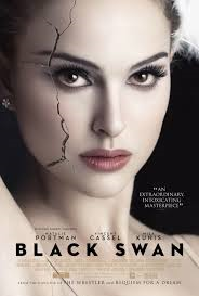
I have researched some already existing psychological thriller film posters to get some ideas for when I make one for our Left Behind Trailer.
The common convention used within these posters is that they all include a close up of the main character's face. The text is very simplistic and the title is commonly found under the face. The colour schemes used in this genre are mainly dark colours like black and grey.
I like these posters because they are landscape and differnet to conventional psychological thriller posters. I prticually like The Snowman film poster as it is a still taken from the trailer and film isteslf. This helps viewers link the two together, creating a wider audience for the film.
For my poster, I will link back to my research and include a dark colour scheme. We have discussed these conventions and we both think focusing on a character's face would be unsuitable for our posters and magazines as our trailer is mainly based on locations and events. We think that relating to an event in the trailer will be more impactful as audiences are more likey to remeber a scene than a face from our trailer. Therefore, using a photo of a recreated scene from our trailer will be more impactful as audience will recongnise the film/trailer from the image.


Excellent evidence of research into existing posters .
ReplyDelete